ABC network navigation redesign
Gerry helped the ABC reimagine an accessible navigation system.
The Australian Broadcasting Corporation (ABC) Digital Product design team consulted with diverse audiences to design a connected 'network navigation' pattern that would seamlessly steer them through and between products. Gerry helped the ABC design, build and deploy this solution.
Navigation

Gerry worked with the digital product team to ensure everyone can use it by specifying design requirements. For example:
Visual clarity & keyboard access
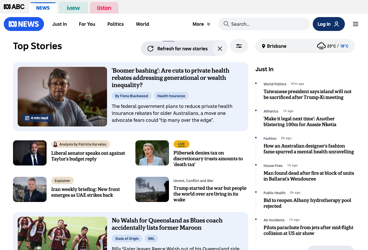
Sighted audiences must see which network navigation tab is active at any time. In this example a blue bar at tab top shows News is active.
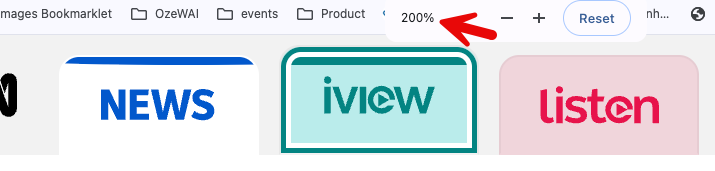
For audiences who don't use a mouse, keyboard focus must always be visible. In this example iview has a prominent focal ring that contrasts strongly with its background, and it is clear that iview will be actioned when triggered with enter or space.
For audiences with low vision tabs and their states must be clear when zoomed.
For audiences who prefer reading with 'high contrast' enabled, control states must remain clear. Again News is the active link while iview is focused.

Assistive technology support
For audiences who use assistive technologies like screen readers and Braille devices, their use assistive technology must explain what each control is, how it works and its current state.
Gerry chose a navigation link pattern for these 'tabs' because each product launched its own page and URL on load, and because operation would be more intuitive. He required:
- What: Component labelled 'Explore the ABC… choose an experience, navigation'
- Name and State: Each link is explained as a link for the product with its state explained. For example “Current page, link ABC News”
Menu drawer
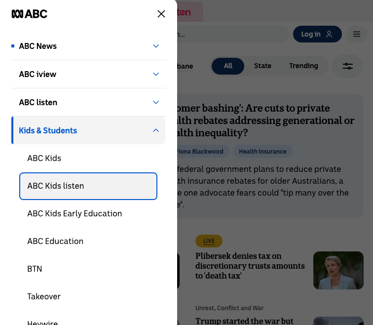
ABC wanted to deepen its network navigation proposition with a side multilevel menu drawer. Gerry chose an accordion pattern with nested levels to explain controls, states and hierarchies for all audiences. The visual pattern shows sighted readers what the menu drawer is and how it works. A dot explains the active link is ABC News while the focal ring shows ABC Kids listen has keyboard focus.
Gerry implemented an accordion pattern that explains component use to screen reader users. This video demonstrates use of the component in several ways including Voiceover screen reader on MacOS:
Gerry's Accessibility Requirements contributed to broader design requirements, efficiently guided developer implementation and testing.
Outcome
ABC's Network Navigation Redesign was completed on time and within budget.
Gerry's work on the ABC network navigation redesign was released in stages from late 2025. ABC claims its redesigned navigation system feels cleaner, smarter, and more aligned with how people use the ABC today.